Artistic v Autistic
In my many years as a graphic designer, I’ve worked on materials for an incredibly diverse audience. Whilst it is the function of design to make things look good, it’s really as much about function as it is form. We’ve all come across documents that have evidently been written by a corporate committee of people, seemingly from a planet that speaks its own rarefied dialect. One that ticks boxes of corporate accountability, one that can write something that everyone approves of, and one that sounds kind of professional, but ultimately delivers an inscrutable end result.
Everyone has an opinion, but where some opinions can hinder design is when they are interpreted as fact. So, sometimes people may not ‘like’ certain words, colours, images or concepts, but that doesn’t mean these things are wrong. I remember a client once reacting quite badly to a specific colour I had used predominantly and insisting that I should not use it. I had selected the colour as it complemented the images in the document and several of the key logos. I was sufficiently confident to push for my colour selection to stay, as it really was ideal for the job and eventually discovered that the client’s dislike went back to their childhood and reminded them of bedroom wallpaper they had always loathed! Not really a justifiable reason for a redesign. This example illustrates how subjective our decisions about what is visually right or wrong can be, and why it is really important to filter out, as best we can, what is fact and what is just subjective taste. I hate celery, but there is nothing wrong with it really – even though I think it should be banned.
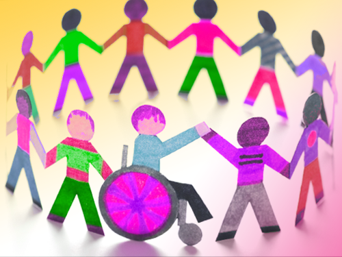
A graphic designer’s job is to take the content ingredients and make them into something appealing, accessible, relevant and on-budget. There will be text to negotiate, logos to include, photographs to crop and adjust, colours to integrate and formats to fit, and these challenges are part of the job. I am not averse to changes but when it feels like it is for the sake of it, it can irk! Where we can really learn is when we are tasked with making information relevant to groups that may ordinarily be overlooked.
Feedback from the audiences of intended material can be crucial to getting it right, and over the years, I’ve worked with people with learning disabilities, women who have survived domestic violence, children with HIV, people who have lived with severe heart conditions and people with visual impairments. In these cases, feedback and involvement was a crucial step in the creative process that went far beyond ticking any arbitrary ‘inclusivity’ box. Their contributions genuinely helped to ensure that the end results were the best they could be.

LINK: http://www.liverpoolmuseums.org.uk/learning/autism-sessions.aspx
I am proud to have recently designed a suite of resources for National Museums Liverpool, an organisation that is always striving to improve and make its exhibitions and premises as inclusive as possible. Autism is a condition that is becoming increasingly recognised as something that we can help to make a difference with, and improve experiences for people on the spectrum. These resources were written, photographed and designed with feedback from people with autism whilst actually visiting the locations in which they will be used.
Adding in this step meant that it took us longer to complete the job, but importantly it allowed us to identify issues that may not have ordinarily been considered. Design should never be about the designer, it is not art, it is information. We can use our skills to make the information appealing, clear and relevant, but accessibility, whilst often overlooked, never should be.
- Blog
- Accessibility, National Museums Liverpool
- April 10, 2018
Related Posts