The punishment of luxury
I like it when my joint worlds of art, design and music collide. It’s a collision of the nicest kind…
Last year, one of my favourite bands, Orchestral Manoeuvres in the Dark (OMD) released a new album. They’ve been at it now since the late seventies and The Punishment of Luxury is their 13th studio album. The album’s title was inspired by a painting that I’m familiar with from my many recreational and business-related visits to Liverpool’s Walker Art Gallery.
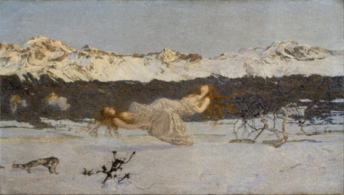
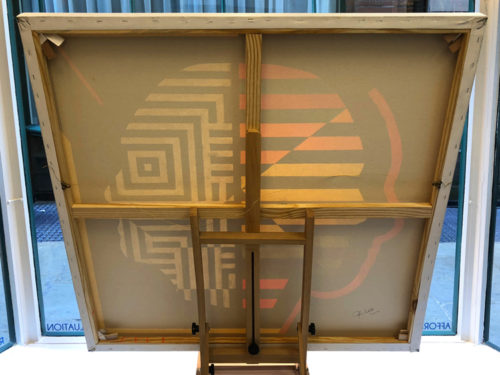
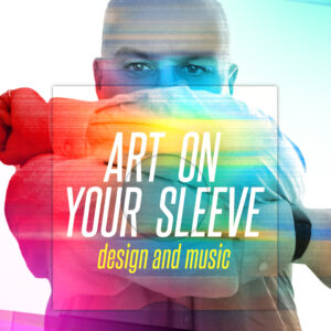
In the gallery, there’s a painting by Giovanni Segantini (1858-1899) entitled The Punishment of Lust. This painting may well have provided inspiration for the album’s title, but the band chose to explore a completely different direction for the design of its sleeve, created by local artist, John Petch. Petch used paint on canvas to create a contemporary piece more appropriate to the sonics of the album than its referential title may suggest. What’s also interesting to me about the cover image is that I had previously assumed it was computer generated because of the angular nature of the image with its perfect right angles, lines and flattened bright hues.
Last week I attended an event at a local art gallery, Dot-art, as part of Liverpool’s annual Light Night, city-wide arts and cultural event. The gallery hosted an exhibition of Petch’s works – paintings, prints and preliminary sketches, and I got to see it close-up, along with a live gig by OMD themselves, which was a rare and special treat. They can’t have played a venue this small since their humble beginnings, and people had travelled from places as far as Germany and Saudi Arabia for the intimate outdoor gig.
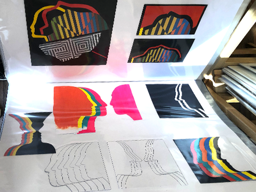
In the gallery, I really enjoyed viewing the sketches behind the final works, these are rarely seen, so it was fascinating to see what could have been, and the stages that led to the final works. Below is the brief that John Petch was given by OMD and his written rationale behind the final design:
- Something that would be geometric, abstract with lines/spaces.
- The design must work at icon/thumbnail size as well as at a larger poster scale.
- Three demo tracks [were provided] – ‘The Punishment of Luxury’, ‘La Mitrailleuse’ and ‘Robot man’.
- Reference to a painting by Giovanni Sagantini ‘The Punishment of Luxury’.
- The band’s interest in art as seen on previous album covers.
My original design thinking was to represent change by using abstract geometric art forms colour to black and white. An emotional response with a change of view point from human to mechanical creating a tension from what is known and experienced to what is new. Moulded by technology, advertising and influences, constant change for good and bad, we are on a gurney which includes transformation. the resulting artwork is a combination of ideas which are open to interpretation.
Liverpool continues to surprise and delight with its cultural and artistic events. Music is at the heart of the city and art is its lifeblood.
Further information about John Petch at Dot.Art can be found here: www.dot-art.co.uk/exhibitions
- Blog
- Graphic Design, John Petch, OMD
- May 25, 2018
Related Posts


Ali Filder
Excellent review by Andrew Dineley, it flowed really well, gave great insight too, informing of the context of the title and actual painting that first captured Andy’s imagination.
Being both a local to the where the boys began and long term fan .. wonderful to a have fellow die hard writing the review on our boys & the John Petch exhibition at dot.com gallery and be attendance of the intimate and most privileged gig .. was a sheer honour.
Andrew
Thanks Ali, that’s really kind of you. I’ve since added a few extra pieces to the post so there’s now additional info that may be of interest too 🙂