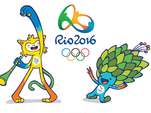
Vinicius and Tom
The 2016 Olympics is coming to an end this weekend, in Rio. I’m not a big fan of sports in general, but it’s hard not to be seduced by the spectacle of it all, particularly when your home country manages to exceed all expectations. As one of the millions of spectators of this worldwide event, it’s always interesting to see how design is used as a tool to promote, package and visually harmonise a huge global event.
When the UK hosted the 2012 Olympics in London, the design was internationally derided. This saddened me, as British design is some of the best in the world and it felt like a huge missed opportunity. From the fractured logo, to the bespoke font, to the colour palette that relied on a lurid pink, to the ghastly mascots – Wenlock and Mandeville. These monstrosities were clearly designed by committee, so I feel the pain of the creative team at Wolff Olins.
I seem to recall that there was public involvement in the design and can imagine the ‘helpful feedback’ that the designers inevitably had to respond to… “Can you make them not fat or thin?, they should not have a specific gender, they shouldn’t be identifiably part of any existing culture, can they not have two eyes each please, as not everybody has two eyes… Any designers reading this will be all too familiar with these kind of suggestions, they may be well meaning, but ultimately have the potential to disable creativity and shackle design. The old adage “a camel is a horse designed by committee” comes to mind.
As with most design – familiarity eventually softened the public embrace of the creative solution, proving that time can heal even the deepest of design wounds! I’m still smarting!
Less of the negativity, Andrew, move on… I’ve been massively impressed this year with the corporate design for Rio, created by Birdo, a studio based in São Paulo, Brazil. The fluidic main logo, with its gentle gradients and complementary curvaceous logotype, both work incredibly well. The anachronistic static Olympic rings actually look out of place in such a modern design context. The untouchable is crying out for a gentle update to help them fit into their temporary new home.
This year’s mascots, Vinicius and Tom also deserve some love. They remind me slightly of Cobi, my all-time favourite Olympic mascot designed by Javier Mariscal. Sadly these mascots have been mysteriously elusive this year which is a shame as they’re wonderfully original, and if they so desired could give the more high profile Wenlock and Mandeville the good slap they deserve for being so freakishly ugly and bringing shame upon an event with such a prestigious design legacy!
Vinicius and Tom are worth looking into as there’s a delightful back story, some clever merchandising and gorgeous animation. Their names come from local bossanova composers, Vinicius de Moraes and Tom Jobim. From the website of Birdo…
“Our main inspiration for creating the mascots was the great diversity of Brazil’s nature, people and culture. That’s why Vinicius, the olympic mascot, is a mixture of all Brazilian animals and Tom, the Paralympic mascot, is the union of all Brazilian plants. Vinicius also has a special power: he can stretch as much as he wants, what can be very useful to give a hug on a big group of friends. His power represents the Olympic athletes’ will of reaching higher and higher. Tom, on his side, can find any object inside his leafy hair to help him solve every situation. His power represents the reinvention of the Paralympic athletes.”
Congratulations to the UK for ‘smashing it’ as I keep hearing, and to Brazil for hosting the 2016 Olympics with such wonderful attention to design detail.


Andrew C
I love the Rio branding – it all works rather well and is as good as could have been hoped for. Like you, I still have no time for 2012’s effort – though it was very much of its time and not designed with longevity in mind. The design giants of past Olympics—notably Mexico ’68 (http://www.lancewyman.com/) and Aicher’s Munich ’72 (http://www.1972municholympics.co.uk/)—set an impressive precedent and I can’t help feeling that this legacy and its enshrinement in design history and teaching, fed a too knowing, too self-concious approach to 2012. However, we, as designers ourselves, are well aware of how daunting a project of this scope would be…
Andrew
I can’t imagine what I would do with such a proposition. That’s one of the first things I always consider when being critical of other people’s design – what would I do that would make it better? Sometimes there are political constraints that end up damaging any good ideas and I fear that is what happened in 2012. The whimsical nature of this year’s efforts however make me think that there was plenty of freedom, coupled with enough local knowledge of culture and history. It’s a job supremely done in my humble opinion.