All together now
If you just want images, they are below, but before that, we need some context…
In my last blog post, I looked back at previous Eurovision Song Contests while we were waiting to hear who the host city would be in 2023. You can read about that HERE.
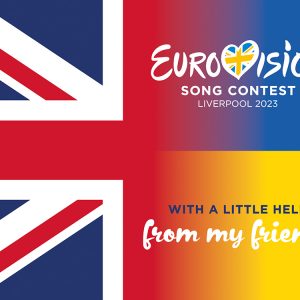
Well… the news is now in, and against all odds, or certainly the odds of the bookies and many fans across the world – it’s Liverpool and I couldn’t be happier. I’ve always known that my home city was more than capable, but feared that anything we had to offer would be overshadowed by the sheer size of Manchester’s venue. But as I mused in the last post, it is about so much more than a venue, and the sterling work that Culture Liverpool has done has paid off.
Exciting times are ahead for fans of the contest and the people of Liverpool as we brace for the impact this is going to have. On the lead up to the announcement I shared a few ideas on social media for my own pleasure that got people talking and it was interesting to offer my own creative perspective on the contest. One of the things I enjoy most about Eurovision is seeing how the host nation visually interprets the contest and stamps its own unique identity on things. In recent years I was most impressed by the concepts that The Netherlands developed for the cancelled show in 2020 and its COVID restricted follow-up a year later, both the incredible work of CleverFranke.
Last year, I found the dark tones and the dominant browns really gloomy, and really not what I wanted to see for such a joyful contest. For an event that was themed ‘The sound of beauty’ for me, the design just wasn’t, well… beautiful. To quote from the press release at the time – “Turin’s theme is a visual representation of The Sound of Beauty. In order to represent sound and its visual (and beautiful) properties, the design is based on the symmetrical structure and patterns of cymatics – the study of sound wave phenomena.” I am aware that sometimes things that can sound right intellectually don’t always translate into a successful design.
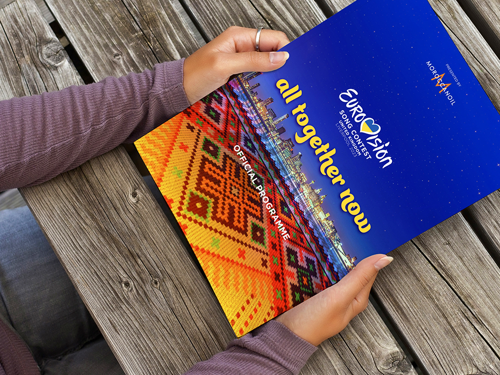
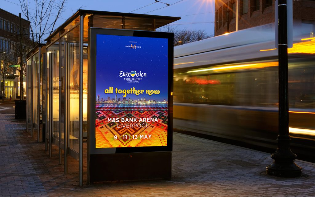
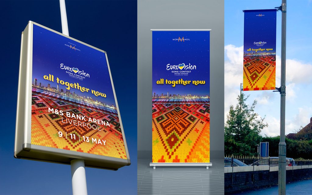
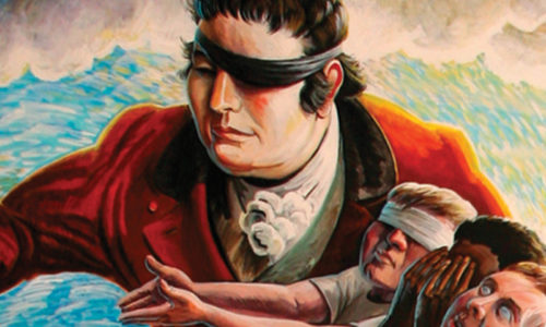
So where does Liverpool go? I don’t have the definitive answer but I have ideas and I set myself a brief to come up with something that I think might work. I allowed myself a limited five hours for the entire project – from concepts to final artwork as I do have things to do and this was just a creative experiment that may not have even got beyond my design studio, but here you are, it’s out there now.
There’s been a lot said about the musical heritage of Liverpool and this cannot be overstated. It’s in our souls and continues to be so, despite some people thinking it all started and ended with The Beatles before I was even born! It makes sense though to use a song as a theme, but it has to be relevant and “All together now” works well in this respect. It’s a quite obscure song by The Beatles but it was hearing the song by The Farm, with the same name, that made me think this could work. Video HERE.

- It’s time for us to join all together now, after COVID lockdowns.
- It’s time to unite behind Ukraine and show solidarity, showing that we are on the same side – we are all together now.
- It’s time to show that music can be a force for good as certain parts of the world lean into divisive right wing ideologies.
- Blog
- Culture Liverpool, Eurovision Song Contest, Graphic Design, Liverpool
- October 11, 2022
Related Posts

Sandra
These images are amazing! Well done.