Back to the future
I design a lot of logos. I spend ages on them, pushing around every element – pixel by pixel, vector by vector. They’re hard work, what often appears as deceptively simple, is usually the result of dozens of iterations and experiments. Preparing something that harmoniously sits together, with considered capacity for use in multiple formats across multiple platforms isn’t something that can be automated or rushed. Good logo design is an art form for graphic designers.
Knowing this, one of the first questions I ask clients who tell me that they need a new logo is “Are you sure?”. If I can see that they’re enduring something that someone clearly threw together in Microsoft Paint, with their eyes closed whilst under the influence of some judgement impairing substance, I will of course happily ease their pain and expediently guide them to the light. But, sometimes I see logos updated and designed when I can’t really understand why. Out with the old and in with the new, isn’t always a good enough reason. Logos are something that we grow to love, they rarely appeal on first viewing but almost always become familiar friends. They should be nurtured and looked after by swaddling them in lovely design. The logo is just one part of a design, but it is the heart and a broken heart is never a good thing.
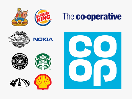
Over the years, many corporations have evolved their logos to great effect, all jobs that were necessary to embrace emerging markets and remits, or just to stay current with visual trends. The examples (above/left) for Burger King, Nokia, Starbucks and Shell are all good examples. Recently Co-op did something radical and re-introduced a logo that I grew up with to replace what they’ve been using for a long time.
This is a brave move, one that I welcome, and an example of how logos can sometimes be updated for the wrong reasons. For me, Co-op is a company that differentiates its brand by projecting an image of being for the people. It’s friendly, it cares and it has ethics. The company’s visual branding, however, has felt weak to me for the last couple of decades, it embodied none of the values of their brand. It was cold, anodyne and stiflingly corporate. In contrast, their old cloverleaf design was something that we grew up with and it seemed to embody their values much more wholesomely. It was the friendly face of an ethical company. There is something a little old fashioned about the design but this is not to its detriment, it illustrates that sometimes things should be left alone. An old logo can be infused with new vitality through the implementation of good design, and this is thankfully happening.
There’s commercial mileage in nostalgia, and many companies flirt with it to celebrate anniversaries, M&S and John Lewis being two good recent examples, but to my knowledge none have actually re-introduced a logo from the past as a permanent replacement. It will be interesting to see how this goes down, but so far so good… Staff in stores are already wearing turquoise, and carrying one of their new/old shopping bags recently filled me with a warm nostalgia.
Bravo Co-op, old is the new new.
- Blog
- Co-op logo, Graphic Design
- June 2, 2016


