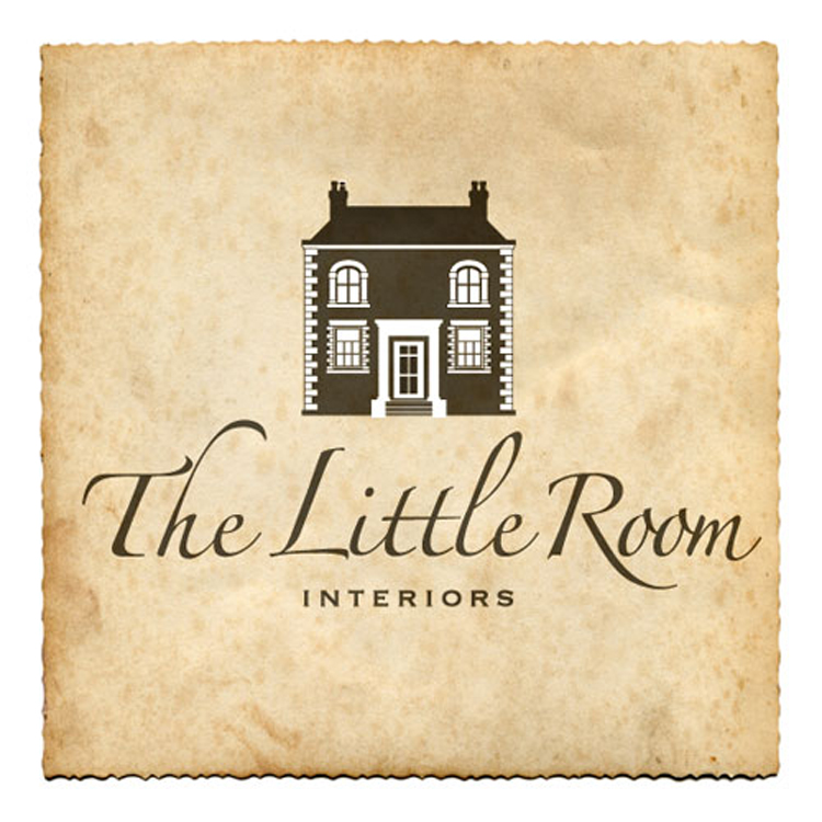
The Little Room
The Little Room in Liverpool is an exquisite interior design store, small but perfectly formed and their brand update needed to reflect this. This shop has grown in scope over the last ten years and is about to embrace e-commerce so a serious evaluation of their logo and its suitability and flexibility for future needs was critical. We look forward …
Read More
- Portfolio
- January 26, 2015
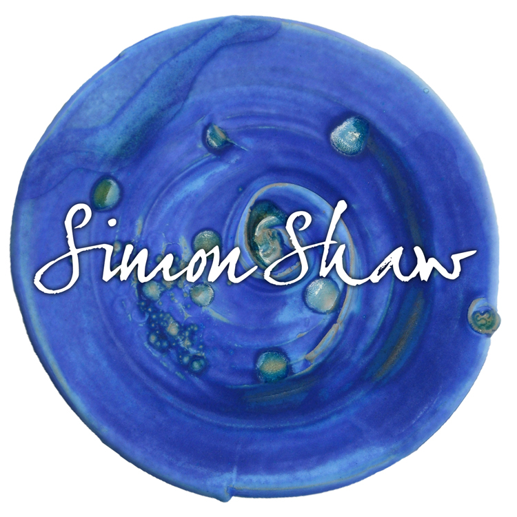
Simon Shaw’s Clayhouse Ceramics
Simon Shaw’s beautiful ceramics can be seen in galleries across the UK including Liverpool’s Bluecoat Display Centre. He needed a logo that didn’t dominate when used in conjunction with images of the ceramics. This was achieved nicely with the design of a bold, yet sensitive logotype and range of promotional cards. metaslider id=757 “Fast, reliable and professional – the …
Read More
- Portfolio
- January 26, 2015

Qwikprint
Qwikprint are an excellent local printer that Soft Octopus has used for years. we try to keep it local wherever possible so we can meet suppliers face to face and also help reduce our carbon footprint. It was a pleasure to work with them on this brand update as we never really liked what they had before we got our …
Read More
- Portfolio
- January 26, 2015
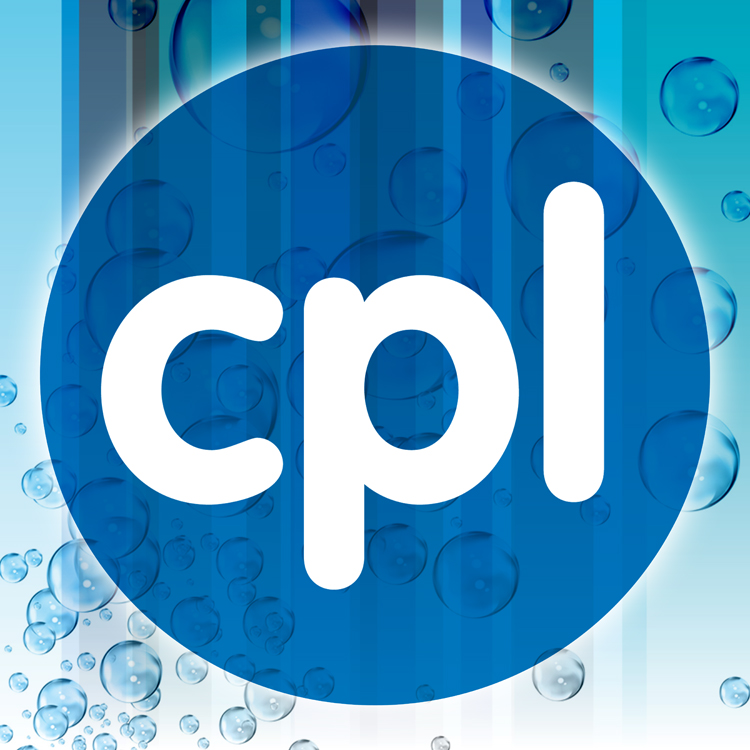
CPL Dental Practice
An identity was required that projected this dental practice as modern and fresh. Water droplets and a dynamic stripe device were developed and applied to all materials to set it apart from the many other practices. These elements were combined with a simple, iconic CPL roundel that may eventually be used on staff uniforms and enamel identity badges. metaslider …
Read More
- Portfolio
- January 26, 2015
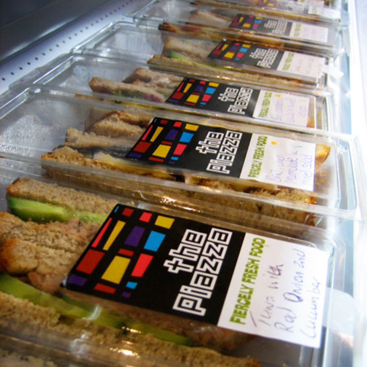
The Piazza
The Piazza required a brand that reflected its prime location at Liverpool’s Metropolitan Cathedral. We used this as inspiration, sampling the striking colours and bold frames of the stained glass. These became an an integral part of the logo which we deconstructed and used elsewhere for large window decals and interior details in the restaurant. metaslider id=755 “We love …
Read More
- Portfolio
- January 26, 2015
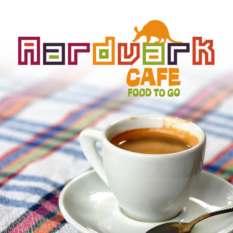
Aardvark Cafe
The Aardvark outlets in Liverpool and Manchester are a sister company of The Piazza. We were asked to devise a brand that was unique yet consistent, so the playful animal icon was born and used on packaging and prominently inside to create a dynamic interior decoration. The fruity hues in the logotype were carefully selected to emphasise the ‘Fiercely Fresh …
Read More
- Portfolio
- January 26, 2015
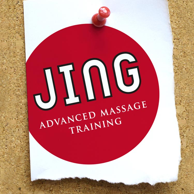
Jing Advanced Massage Training
Brighton-based Jing approached us to help consolidate their disparate range of corporate materials and branding for print, film and online. We transitioned their corporate identity gradually, evolving it into the strong and unified brand they have today. Jing has since grown to become the biggest provider of massage training in the UK. metaslider id=1071 “Andrew is a design genius! …
Read More
- Portfolio
- January 26, 2015
Recent Comments