Circular thinking
Back in June this year, the International Eurovision Song Contest fan club – Organisation Générale des Amateurs de l’Eurovision put out a call to graphic designers across the world. Quite rightly they had identified that their ageing logo was no longer fit for purpose and something more dynamic and flexible was required.
The breadth and scope of the Eurovision Song Contest has expanded rapidly over the last decade, a lot more countries are now involved, and the profile of the fan club, like the event itself, is now more reliant on social media and the internet as its primary channels of communication. An updated brand identity for the fan club was crucial if the organisation seriously wished to stay current and flexible to the requirements of the many satellite clubs around the world.
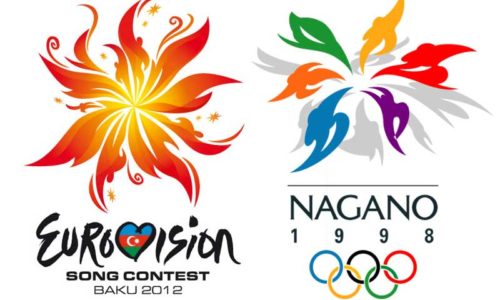
About 40 different logos were submitted from almost every territory of Eurovision and the European Broadcasting Union umbrella and five final designs were selected. As it turned out, each of the five designs was from a different country: Denmark, Norway, Sweden, Turkey and the United Kingdom. These logo designs along with examples of how they could be used across corporate/promotional materials were then circulated to the clubs of 36 different countries for voting. How very Eurovision!
I can now reveal that my proposal was the most popular in the voting, scooping up an impressive 46% of the international vote – the full statistics are available at THIS LINK. Already two regional fan clubs have requested use of the brand so the logo has been localised for use in Israel and Slovakia with more potentially to come. It is the hope that the new identity will be implemented across the world to unify the fan clubs of each country.
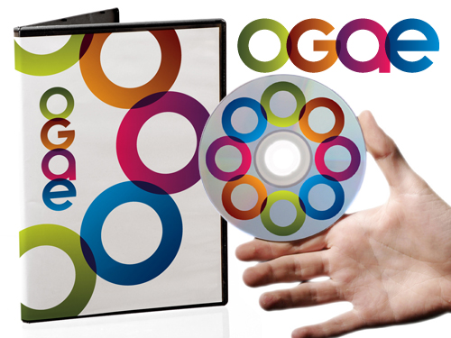
So why did I create this logo and why does it look the way it does? Nothing comes for free when one puts a design together from scratch. You begin with a blank digital canvas and this was certainly the case with this logo as I couldn’t find a typeface that did exactly what I wanted. Each of the four characters was constructed specifically for the logo. Design is often a reductive process and the final design should only contain essential elements, anything redundant or perfunctory should be discarded. It’s like cooking, add too many ingredients and you’ll ruin it.
I started off the design with a list of things that represent Eurovision – musical notes, microphones, musical instruments, the globe, maps and flags etc. One has to explore all avenues in order to ascertain which routes ultimately lead to a dead end or hackneyed visual cliché. The strongest logos are the simplest ones and all five designs shortlisted for voting followed the simplicity principle.
After discarding almost everything I had created, I was left with a single globe – a simple circle that represented the whole planet. I used this shape to create the other three letters, adding and subtracting elements to form each individual letter. It wasn’t possible to design four characters that were exclusively upper or lower case – so in order to retain visual integrity – a mix of upper and lowercase characters were used, but this compromise meant the end result was more visually harmonious than it could have been if I’d been a purist about capitalisation or otherwise. Design is always about compromise.
After toying with dozens of colour variants and attempts to integrate key colours from the flags that comprise the Eurovision Song Contest, I once again opted for less being more. An earlier version of the logo contained stripes and slashes of colour that may have visually referenced the various countries, but it was never going to be possible to represent every territory and this was something that was likely to continue changing as Eurovision inevitably continues to extend its global reach.
If you can’t include all the colours then how about avoiding all of them? Flags commonly use flat colour, so I decided that gradients could be an alternate solution. They can’t be connected to any specific country and are a subtle visual reference to the merging of cultures and styles and also worked well with the overlapped characters. Everything is locked and merged together – a harmonious entity comprising different shapes, shades and colours to form a unified whole. That’s what Eurovision is, the coming together of different cultures, ages, styles, countries, genders, creeds and everything else. The logo shares these same ideals and is aided in its aim with the optional addition of a graphic icon, a globe of globes – harmoniously linked and unified.
I know that not everyone will love the logo, that’s never possible and I got over trying to do that decades ago, but I do believe the design has the potential to do its job impressively and look forward to seeing how it ends up being implemented by groups across the world. Power to all our friends…
Thank you to Shau Chan for telling me about the competition, I wouldn’t have even known about it if she hadn’t let me know!
- Blog
- Eurovision, Logo design, OGAE
- October 27, 2017
Related Posts