The ins and outs of it all
Well, the day is almost upon us. The UK gets to decide its future in the European Union tomorrow. I started off about 70% leaning towards Vote Remain, the uncertainty of the alternative wasn’t something that I could comfortably reconcile. As with anything I’m unsure of, I did some reading – a lot of reading, actually. I appreciate that facts will always come with a degree of bias, depending on what filter we choose to view them through, but it didn’t take long for me to move that extra 30% to a unanimous decision.
As much as it troubles me to be in agreement with our Prime Minister, David Cameron, the alternative big mouths are a lot worse, and certainly aren’t characters that I would trust with the things I hold dear. I’ve never been one to follow the crowd, but I do listen to voices of authority before I make up my own mind. This seems fundamental. Most of the people saying most of the sensible things seem to be mostly decent. There’s a pattern there and I like patterns.
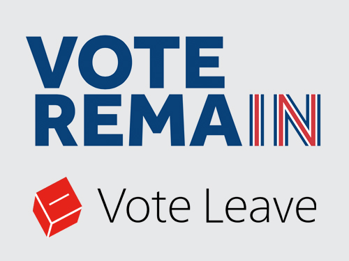
The ways in which campaigns are presented is always interesting to me from a creative perspective. How are messages being delivered, what channels seem to be working best, how innovative have they been, what kind of language is being used and how does it all look? The geek in me instantly saw a visual comparison with the logo for the Vote Leave campaign. Anyone who knows their computer history will know that, for a period, Steve Jobs didn’t work at Apple. During his ‘wilderness years’ he set up his own computer company called NeXT whose logo was designed by legendary graphic designer, Paul Rand. A NeXT machine was also the computer that Tim Berners-Lee would use to devise what would eventually become the world wide web. I digress, but that’s what the logo reminds me of. I also think it’s weak in comparison to the design for the Vote Remain campaign.
Bold isn’t always best, but if you are competing for the same audience and your competitor’s campaign logo uses bold characters in uppercase, I’m not sure it’s wise to go for a lightweight font, predominantly set in lowercase. Yes, it is in stark contrast and it’s unlikely that we’d ever get the two logos confused, but Vote Leave looks weak and pallid, whilst Vote Remain seems bold and forthright.
Vote Remain, stacked up and left aligned, with a gentle reference to the flag cleverly integrated into the two letters that remind us that this is about being IN, makes for a strong logotype. It says it all quite elegantly, using appropriate colours, with no tokenistic graphics. The Vote Leave logo, in contrast, with its questionable kerning, and shrill colour selection, uses type that appears to be drifting away from its perfunctory graphic icon. I feel that the Vote Leave message has all been about negativity, so it does however feel apt to have a minus mark on that little red tilted cube. Oh! It’s a ballot box – do we really need this visual reminder that this is about voting?
I have tried to remain unbiased and believe that I would still hold these views even if the campaign messages were switched. Design is just one small part of how we perceive a message and the logo is not the brand, but ultimately I feel we have two logos that sum up how I feel about their aims – one is direct and strident, the other is a vague, visual manifestation of negativity and division.
Go tick that box.
- Blog
- June 22, 2016
Related Posts