Blood & Glitter
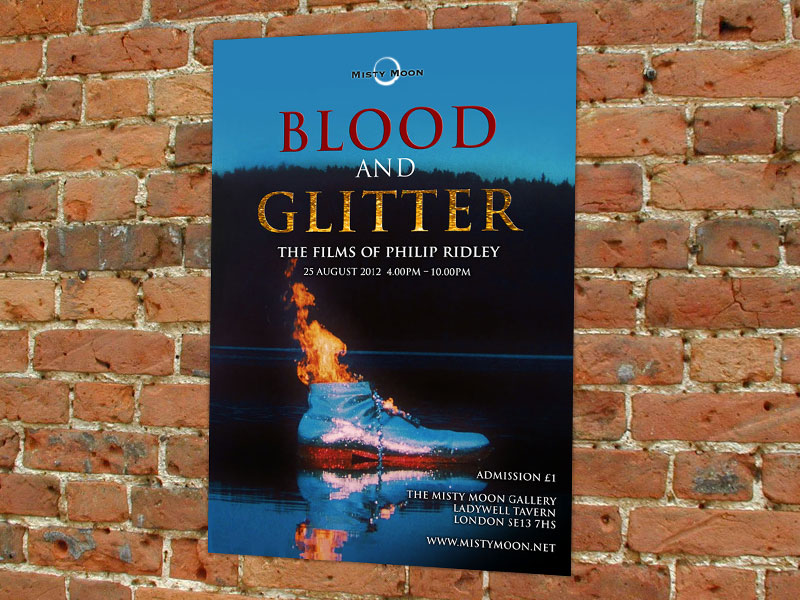
Most of the work I design is for public sector or health related causes so it’s nice to do something a bit different. Above is a poster/flyer for a film night at a gallery in London celebrating the work of Philip Ridley. I like the surreal image I was asked to use and the paucity of words. The ‘less is more’ dictum is almost always applicable to graphic design and as a principle is employed by the most celebrated of designers. Often, I feel my design work risks being seen as cluttered with written content because space is erroneously considered something that must be filled.
So often I am dealing with cancers or mental health so it’s quite refreshing to be scattering a little blood and glitter across my portfolio. Sadly, I can’t attend this event so won’t see the materials in situ – being projected and in print, but it was nice that Attitude Magazine gave the event a nice bit of promotion, showing off the design in full. Good luck to David and the gallery for the event, I hope it’s a sell out.
- Blog
- Blood and Glitter, Misty Moon Gallery, Philip Ridley
- August 17, 2012
Related Posts