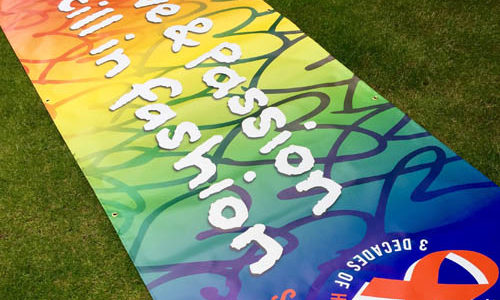
Graphic humour
I write a fair bit about graphic design and music, whether it’s for Classic Pop magazine, the ‘Art on your sleeve‘ podcast or just general musings in my dedicated Facebook group about the subject. It was record sleeves that made me want to be a graphic designer, tantalising me with their beguiling concepts and creativity. As a kid, before I could afford to buy my own records or had any understanding of what was supposed to be good or bad, I was captivated by record sleeves and their centre labels that would hypnotise the young Andrew as they spun around at 33 or 45 revolutions per minute.
It has to be said that most of what I write is in celebration of design, an appreciation of a dying art in the dominant digital domain. Before vinyl was fetishised and collected by people who may not even open up, never mind actually play their purchases, record sleeves were an integral part of the pop package and their twelve-inch size gave them added impact. Something that really cannot be said for a thumbnail image on a smartphone.
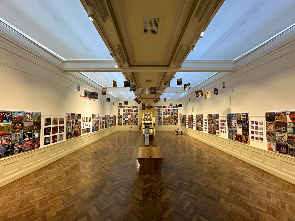
I recently visited an exhibition at the Williamson Art Gallery and Museum in Birkenhead, running until 27 January 2023 all about the other side of record sleeve design, an area much less explored – the worst record covers. What I found fascinating about the collection on display was its diversity – the genres, the visual approaches employed, the budgets and the international markets covered. The collection really was global, and almost everyone will find something familiar in amongst the abundant visual absurdities. To quote from the show’s introduction panel:
Explore Steve Goldman’s collection of over 500 – in his own words – dreadful record covers. The number one criteria to get into the collection: does it make him laugh? Goldman explains that he wants “records where the designers have tried to do something that’s gone horribly wrong”. This fun, family-friendly exhibition showcases Goldman’s vast and unique collection, accompanied by his own thoughts. Huddersfield-based Goldman has been building this collection for seven years, hunting around charity shops and online marketplaces.

And what a collection it is. I spent over an hour working my way around the room, which is adorned from floor to ceiling in an evenly-spaced patchwork of graphic design hilarity. From Barbara Cartland to Black Sabbath, I was amused, bemused and, at times, a little frightened by what was on display. How did some of this ever get signed off? As a designer myself, it was interesting to note how design styles really can define an era, or perhaps the other way around, and also how in some cases, what was old is once again new. There isn’t a great deal of supporting information on display, which felt like an omission as it can at times be difficult to work out if the humour was deliberate or accidental, but thankfully, there is a book to support the exhibition, crammed with additional detail. This is for sale at the exhibition and is essential to fully appreciate some of the pieces.
If you can’t get along to the show, The art of the bizarre vinyl sleeve by Simon Robinson is available online from the publishers ‘Easy on the eye’ at this link: easyontheeyeshop.co.uk/product/the-art-of-the-bizarre-vinyl-sleeve
Below is a link to my podcast with the show’s curators:
- Blog
- Art on your sleeve, Birkenhead, Graphic Design, Record Sleeve Design, Williamson
- November 30, 2023
Related Posts