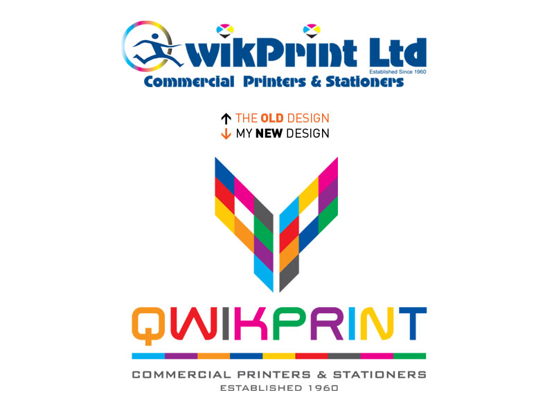
Out with the old – in with the new
It’s nice when you get a chance to fix a logo that you are familiar with and have never liked. Qwikprint is a local printer that I’ve used for a long time and whilst their service has always been brilliant, their logo has always irked me and my design sensibilities.
Last month, Qwikprint got in touch with Soft Octopus to say they wanted to update their brand across everything – from van liveries to signage to stationery to invoices and eventually a website. Marvellous! I finally got the chance to see off something ugly and replace it with something beautiful. You can see the old and the new above and I hope you agree.
The creative development of this design grew, like all the best logos from a simple idea. I took the two first letters of Quick + Print and simplified them into geometric shapes that I then dissected and infused with a range of vibrant colours to represent full colour printing. I love the end result and more importantly, so does the client.
Related Posts

Sandra King
Its lovely Andrew! 100 times better! x
Laura Smith
Lovely and fresh, Andrew!
Andrew
Awww… thanks you two. I really like it too. It’s a bit Pet Shop Boys/Gerhard Richter as well – and that can only be a good thing 🙂 I should also have said that you can see this logo applied to things in the portfolio at softoctopus.co.uk