Transfer/Transform
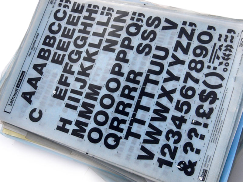
I recently saw a company name I have not seen in a long time – Letraset. Who remembers them? I guess that design students now would have no reason to even know what Letraset once was? For me, as much as I do not miss it one bit, Letraset did help to hone my eye for good typography and is what made me the font pedant I am today.
Letraset, from the 1960s up until the Mac transformed the world of graphic design in the mid-1980s was once the de-facto standard for creative typography.
This transfer lettering came as a sheet of characters that were positioned by rubbing them down, or ‘burnishing’ to be more precise. Letraset made hundreds of fonts available in multiple weights and sizes from single digits (the smallest I ever battled with was 7 point) up into three figures which were ideal for headlines.
Typesetting of course pre-dated Letraset, whether it be metal type or a crude electronic variety, but having sheets of fonts to play with provided so much more scope for creativity. Having to apply EVERY character and piece of punctuation by hand (literally, with the help of a burnishing tool) meant that early on, I learned the importance of good kerning, tracking, leading and also when an apostrophe was or wasn’t needed. With a finite amount of characters to play with, one is very careful about when to use them. Running out meant having to make your own with bits of left over characters which was as ingenious as it was frustrating.
Most of my grant money went on sheets of Letraset which were expensive, but I considered them an investment for my portfolio. I must have had about fifty sheets of various fonts, characters and icons that I used in almost everything I designed as a graphic design student in the 1980s. It is because I grew up with these, that today I can instantly name many fonts and why I get so upset when I see lazily laid out text where someone has clearly let the computer make most of the decisions.
“I first used Letraset when editing the school magazine in the 1970s,” says Simon Garfield, author of Just My Type: A Book About Fonts, and buying new sheets was the equivalent of buying a new LP by T. Rex or Bowie – incredibly exciting. The problem was, applying it was much harder than it looked and there were always bits that wouldn’t transfer properly, and it was almost impossible to keep the words straight, and one would always run out of ‘e’.”
So why was Letraset in the news? It’s sadly shifted manufacturing from Kent in the UK to China and France. but I am surprised it still exists at all really. If you want to purchase some sheets for yourself and see how we used to have to do it, a very limited range is still available at the Letraset website.
- Blog
- Graphic Design, Letraset, Transfer Lettering
- September 18, 2013
Related Posts


disheedee
Just written a nostalgic new blog entry all about my #Letrasetmemories at http://t.co/lyFbucUIlN
jmcloughlin
RT @disheedee: Just written a nostalgic new blog entry all about my #Letrasetmemories at http://t.co/lyFbucUIlN
Laura Smith
Oh yeah. Remember that stuff. I held onto them for years after college because they were so expensive! Used them for labeling and titling all my interior design projects. Getting good spacing was a bear! But done well they made everything look professional!
Harry
This reminded me of the joy and frustration of using rub on transfers. 🙂 I am glad things are easier now!